Urubamba
Scope
Visual Identity · Art Direction · AI-assisted Imagery
Year
2026
Industry
Gastronomy
Live fire. Shared experiences.
Urubamba is a live-fire catering brand that turns private celebrations and corporate events into memorable gastronomic experiences.
Working independently with the founder, I developed the brand from its initial strategic direction to a complete visual identity, combining a bold typographic language, custom illustration and art-directed imagery to create a system that can shift between playful and refined.
The Challenge
Urubamba was created around a simple idea: the cooking itself should be part of the event. Rather than operating as a traditional catering service, the brand brings the grill directly to the venue and cooks in front of the guests: turning fire, food and preparation into part of the atmosphere.
The challenge was to build an identity capable of expressing both sides of that experience: the energy and spontaneity of gathering around a barbecue, and the quality and attention to detail expected from a premium catering service. The result needed to feel distinctive and full of personality without losing the sophistication required to work across both private and corporate events.
Defining the Direction
The initial phase focused on defining how Urubamba should position itself within a category often dominated by either traditional catering aesthetics or rustic barbecue references. The opportunity was to occupy the space in between, finding the balance between character and sophistication.
Urubamba needed to feel playful, but never childish; premium, without becoming formal; and bold, without losing warmth. This balance became the foundation for the visual direction. The brand could be expressive and unexpected when communicating socially, while becoming more restrained and sophisticated when the context required it.
Building a Flexible Identity
The identity is built around contrast. At its core, a bold custom wordmark gives Urubamba a strong and unmistakable presence. Its weight and geometric construction create an expressive anchor that can work independently or take over a composition.
This is balanced by a lighter typographic language and a palette that moves between vibrant, energetic tones and deeper, more sophisticated colours inspired by fire, smoke and the ingredients surrounding the experience.
Together, these elements allow the brand to change its tone without changing its identity — from playful social content to more refined applications, presentations and event materials.
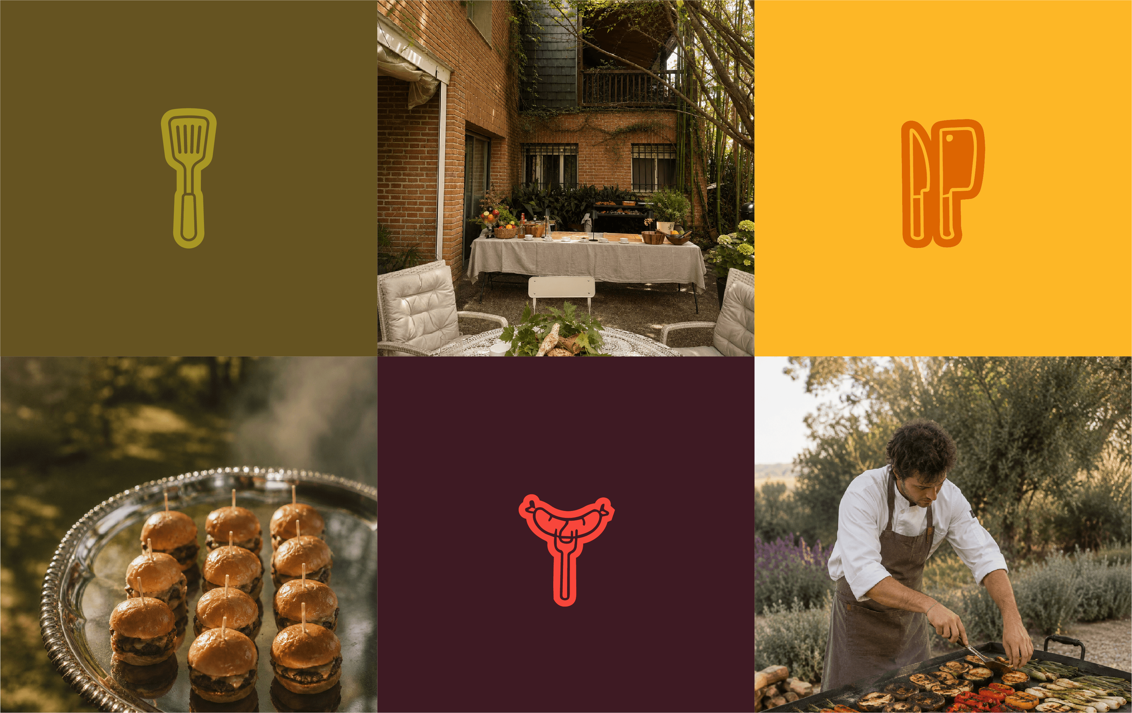
Illustration as Personality
Custom illustration adds spontaneity and humour to Urubamba's visual language working as a playful layer within a more refined system.
I developed a collection of hand-drawn characters and objects inspired by the world of live cooking — grills, utensils, ingredients and food — using simple outlines and exaggerated forms to give the brand a more human personality.
The illustrations work almost like a collection of stickers: they can appear independently, interact with photography or build more expressive compositions around the brand.
This playful layer creates a deliberate contrast with the cleaner typography and more sophisticated photography, giving Urubamba the freedom to be informal and energetic without defining the entire identity through that tone.


Designing for range, not repetition.
Urubamba reinforced the importance of building an identity around principles rather than individual applications.
Within a three-week project, the priority was to define a strong visual foundation that could generate variety quickly without losing consistency.
The contrast between bold typography, playful illustration and more refined imagery became the key to that flexibility. Instead of forcing every touchpoint to look the same, the system allows the brand to adapt its personality while remaining recognizably Urubamba.
The result is an identity with enough character to stand out and enough range to grow with the experiences behind it.
Urubamba
Scope
Visual Identity · Art Direction · AI-assisted Imagery
Year
2026
Industry
Gastronomy
Live fire. Shared experiences.
Urubamba is a live-fire catering brand that turns private celebrations and corporate events into memorable gastronomic experiences.
Working independently with the founder, I developed the brand from its initial strategic direction to a complete visual identity, combining a bold typographic language, custom illustration and art-directed imagery to create a system that can shift between playful and refined.
The Challenge
Urubamba was created around a simple idea: the cooking itself should be part of the event. Rather than operating as a traditional catering service, the brand brings the grill directly to the venue and cooks in front of the guests: turning fire, food and preparation into part of the atmosphere.
The challenge was to build an identity capable of expressing both sides of that experience: the energy and spontaneity of gathering around a barbecue, and the quality and attention to detail expected from a premium catering service. The result needed to feel distinctive and full of personality without losing the sophistication required to work across both private and corporate events.
Defining the Direction
The initial phase focused on defining how Urubamba should position itself within a category often dominated by either traditional catering aesthetics or rustic barbecue references. The opportunity was to occupy the space in between, finding the balance between character and sophistication.
Urubamba needed to feel playful, but never childish; premium, without becoming formal; and bold, without losing warmth. This balance became the foundation for the visual direction. The brand could be expressive and unexpected when communicating socially, while becoming more restrained and sophisticated when the context required it.
Building a Flexible Identity
The identity is built around contrast. At its core, a bold custom wordmark gives Urubamba a strong and unmistakable presence. Its weight and geometric construction create an expressive anchor that can work independently or take over a composition.
This is balanced by a lighter typographic language and a palette that moves between vibrant, energetic tones and deeper, more sophisticated colours inspired by fire, smoke and the ingredients surrounding the experience.
Together, these elements allow the brand to change its tone without changing its identity — from playful social content to more refined applications, presentations and event materials.
Illustration as Personality
Custom illustration adds spontaneity and humour to Urubamba's visual language working as a playful layer within a more refined system.
I developed a collection of hand-drawn characters and objects inspired by the world of live cooking — grills, utensils, ingredients and food — using simple outlines and exaggerated forms to give the brand a more human personality.
The illustrations work almost like a collection of stickers: they can appear independently, interact with photography or build more expressive compositions around the brand.
This playful layer creates a deliberate contrast with the cleaner typography and more sophisticated photography, giving Urubamba the freedom to be informal and energetic without defining the entire identity through that tone.
Designing for range, not repetition.
Urubamba reinforced the importance of building an identity around principles rather than individual applications.
Within a three-week project, the priority was to define a strong visual foundation that could generate variety quickly without losing consistency.
The contrast between bold typography, playful illustration and more refined imagery became the key to that flexibility. Instead of forcing every touchpoint to look the same, the system allows the brand to adapt its personality while remaining recognizably Urubamba.
The result is an identity with enough character to stand out and enough range to grow with the experiences behind it.
Urubamba
Scope
Visual Identity · Art Direction · AI-assisted Imagery
Year
2026
Industry
Gastronomy
Live fire. Shared experiences.
Urubamba is a live-fire catering brand that turns private celebrations and corporate events into memorable gastronomic experiences.
Working independently with the founder, I developed the brand from its initial strategic direction to a complete visual identity, combining a bold typographic language, custom illustration and art-directed imagery to create a system that can shift between playful and refined.
The Challenge
Urubamba was created around a simple idea: the cooking itself should be part of the event. Rather than operating as a traditional catering service, the brand brings the grill directly to the venue and cooks in front of the guests: turning fire, food and preparation into part of the atmosphere.
The challenge was to build an identity capable of expressing both sides of that experience: the energy and spontaneity of gathering around a barbecue, and the quality and attention to detail expected from a premium catering service. The result needed to feel distinctive and full of personality without losing the sophistication required to work across both private and corporate events.
Defining the Direction
The initial phase focused on defining how Urubamba should position itself within a category often dominated by either traditional catering aesthetics or rustic barbecue references. The opportunity was to occupy the space in between, finding the balance between character and sophistication.
Urubamba needed to feel playful, but never childish; premium, without becoming formal; and bold, without losing warmth. This balance became the foundation for the visual direction. The brand could be expressive and unexpected when communicating socially, while becoming more restrained and sophisticated when the context required it.
Building a Flexible Identity
The identity is built around contrast. At its core, a bold custom wordmark gives Urubamba a strong and unmistakable presence. Its weight and geometric construction create an expressive anchor that can work independently or take over a composition.
This is balanced by a lighter typographic language and a palette that moves between vibrant, energetic tones and deeper, more sophisticated colours inspired by fire, smoke and the ingredients surrounding the experience.
Together, these elements allow the brand to change its tone without changing its identity — from playful social content to more refined applications, presentations and event materials.
Illustration as Personality
Custom illustration adds spontaneity and humour to Urubamba's visual language working as a playful layer within a more refined system.
I developed a collection of hand-drawn characters and objects inspired by the world of live cooking — grills, utensils, ingredients and food — using simple outlines and exaggerated forms to give the brand a more human personality.
The illustrations work almost like a collection of stickers: they can appear independently, interact with photography or build more expressive compositions around the brand.
This playful layer creates a deliberate contrast with the cleaner typography and more sophisticated photography, giving Urubamba the freedom to be informal and energetic without defining the entire identity through that tone.
Designing for range, not repetition.
Urubamba reinforced the importance of building an identity around principles rather than individual applications.
Within a three-week project, the priority was to define a strong visual foundation that could generate variety quickly without losing consistency.
The contrast between bold typography, playful illustration and more refined imagery became the key to that flexibility. Instead of forcing every touchpoint to look the same, the system allows the brand to adapt its personality while remaining recognizably Urubamba.
The result is an identity with enough character to stand out and enough range to grow with the experiences behind it.