Web Fresno Camp
Scope
UX/UI · Prototyping · Design System
Year
2025
Industry
Youth & Education
One camp. Multiple ways to experience it.
Fresno Camp is a Spanish summer camp offering different experiences for children and teenagers, from residential and day camps to urban, farm and teen programmes.
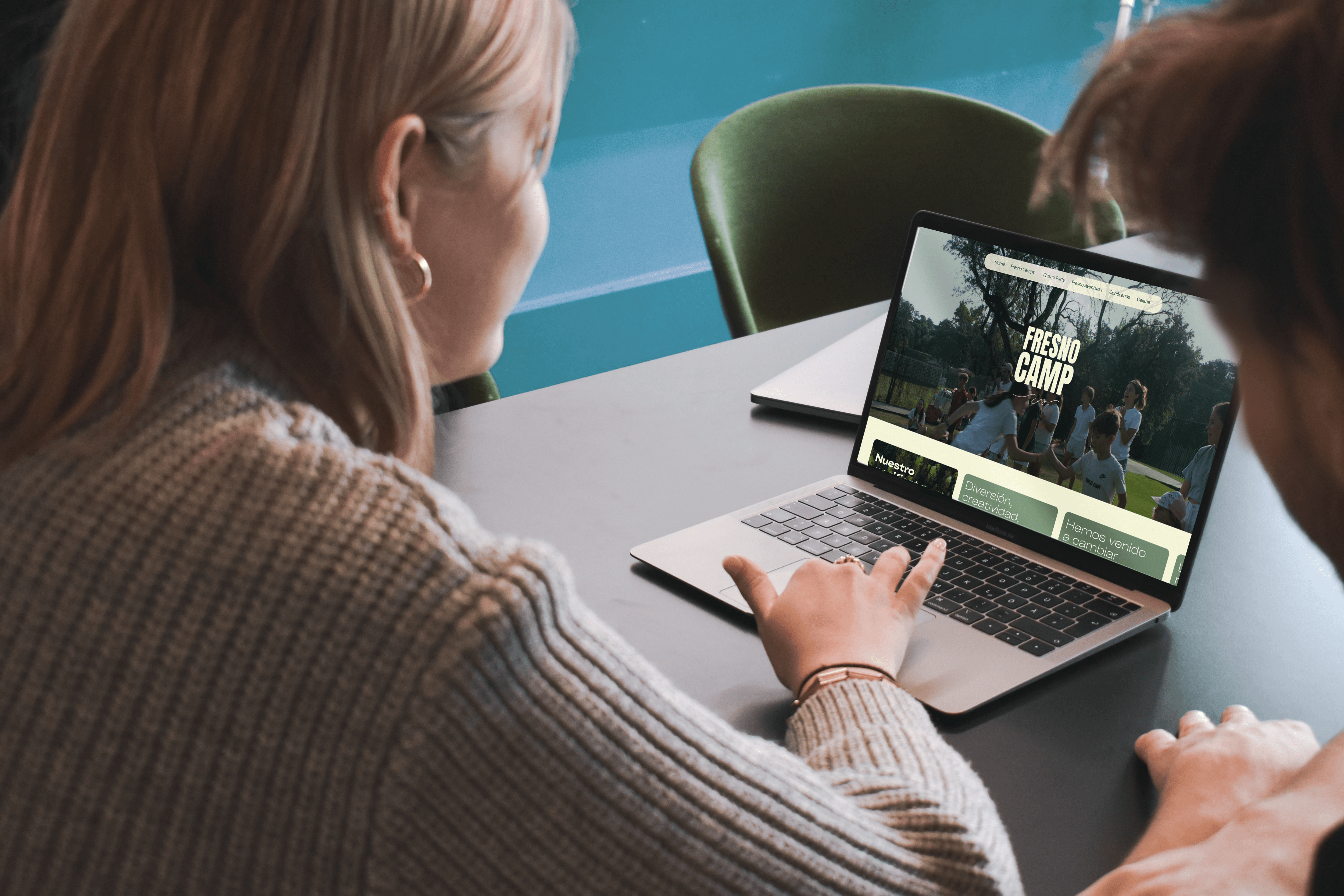
The project involved redesigning its digital experience from the ground up, translating an existing brand into a responsive website capable of organizing a growing range of services while making information easy for families to explore.
The Challenge
As Fresno Camp expanded, its offer grew into multiple programmes designed around different ages, schedules and family needs.
The challenge was to turn this complexity into a simple journey, helping families quickly understand their options, find the right experience and move confidently towards registration, without losing the excitement that makes summer camp appealing in the first place.
Structuring the Experience
The information architecture was reorganized alongside the client to give each Fresno Camp experience a clear place within the ecosystem, separating programmes by format and user needs rather than presenting them as one undifferentiated offer. In this way, we were making every programme easy to find, understand and choose.
Sitemaps, user flows and wireframes helped simplify navigation and establish consistent page structures before moving into visual design.
The result was a scalable architecture that makes a broad offer feel simple — while giving Fresno room to introduce new programmes without rebuilding the experience around them.
Designing for Decision-Making
Fresno Camp needed to appeal to two perspectives at once: the children and teenagers imagining their summer, and the families making the final decision.
The experience balances aspirational content with practical information, creating clear paths through activities, facilities, dates, pricing, wellbeing and FAQs.
Strong content hierarchy, repeated conversion points and scannable layouts reduce the effort required to understand each programme and keep registration accessible throughout the journey.
Turning information into an experience worth exploring.
The existing identity was expanded into a dynamic digital language that captures the energy of Fresno while keeping a content-heavy website easy to navigate.
Large imagery, expressive typography, colour, modular layouts and visual rhythm create a more immersive experience, while reusable components establish consistency across programmes with very different content needs.
The system was designed responsively from the start, ensuring that discovery, comparison and registration remain intuitive across desktop and mobile.


Building for Consistency & Scale
The final experience was supported by a reusable design system covering navigation, programme pages, cards, content modules, CTAs and responsive behaviours.
Following handoff, the implementation was reviewed alongside the development team, refining layouts and responsive behaviour to preserve consistency between design and build.
The result is a more structured, engaging and scalable digital experience, one capable of supporting Fresno Camps's current offer while adapting to future programmes and seasons. More than a redesign this project resulted in a foundation for growth.
Web Fresno Camp
Scope
UX/UI · Prototyping · Design System
Year
2025
Industry
Youth & Education
One camp. Multiple ways to experience it.
Fresno Camp is a Spanish summer camp offering different experiences for children and teenagers, from residential and day camps to urban, farm and teen programmes.
The project involved redesigning its digital experience from the ground up, translating an existing brand into a responsive website capable of organizing a growing range of services while making information easy for families to explore.
The Challenge
As Fresno Camp expanded, its offer grew into multiple programmes designed around different ages, schedules and family needs.
The challenge was to turn this complexity into a simple journey, helping families quickly understand their options, find the right experience and move confidently towards registration, without losing the excitement that makes summer camp appealing in the first place.
Structuring the Experience
The information architecture was reorganized alongside the client to give each Fresno Camp experience a clear place within the ecosystem, separating programmes by format and user needs rather than presenting them as one undifferentiated offer. In this way, we were making every programme easy to find, understand and choose.
Sitemaps, user flows and wireframes helped simplify navigation and establish consistent page structures before moving into visual design.
The result was a scalable architecture that makes a broad offer feel simple — while giving Fresno room to introduce new programmes without rebuilding the experience around them.
Designing for Decision-Making
Fresno Camp needed to appeal to two perspectives at once: the children and teenagers imagining their summer, and the families making the final decision.
The experience balances aspirational content with practical information, creating clear paths through activities, facilities, dates, pricing, wellbeing and FAQs.
Strong content hierarchy, repeated conversion points and scannable layouts reduce the effort required to understand each programme and keep registration accessible throughout the journey.
Turning information into an experience worth exploring.
The existing identity was expanded into a dynamic digital language that captures the energy of Fresno while keeping a content-heavy website easy to navigate.
Large imagery, expressive typography, colour, modular layouts and visual rhythm create a more immersive experience, while reusable components establish consistency across programmes with very different content needs.
The system was designed responsively from the start, ensuring that discovery, comparison and registration remain intuitive across desktop and mobile.
Building for Consistency & Scale
The final experience was supported by a reusable design system covering navigation, programme pages, cards, content modules, CTAs and responsive behaviours.
Following handoff, the implementation was reviewed alongside the development team, refining layouts and responsive behaviour to preserve consistency between design and build.
The result is a more structured, engaging and scalable digital experience, one capable of supporting Fresno Camps's current offer while adapting to future programmes and seasons. More than a redesign this project resulted in a foundation for growth.
Web Fresno Camp
Scope
UX/UI · Prototyping · Design System
Year
2025
Industry
Youth & Education
One camp. Multiple ways to experience it.
Fresno Camp is a Spanish summer camp offering different experiences for children and teenagers, from residential and day camps to urban, farm and teen programmes.
The project involved redesigning its digital experience from the ground up, translating an existing brand into a responsive website capable of organizing a growing range of services while making information easy for families to explore.
The Challenge
As Fresno Camp expanded, its offer grew into multiple programmes designed around different ages, schedules and family needs.
The challenge was to turn this complexity into a simple journey, helping families quickly understand their options, find the right experience and move confidently towards registration, without losing the excitement that makes summer camp appealing in the first place.
Structuring the Experience
The information architecture was reorganized alongside the client to give each Fresno Camp experience a clear place within the ecosystem, separating programmes by format and user needs rather than presenting them as one undifferentiated offer. In this way, we were making every programme easy to find, understand and choose.
Sitemaps, user flows and wireframes helped simplify navigation and establish consistent page structures before moving into visual design.
The result was a scalable architecture that makes a broad offer feel simple — while giving Fresno room to introduce new programmes without rebuilding the experience around them.
Designing for Decision-Making
Fresno Camp needed to appeal to two perspectives at once: the children and teenagers imagining their summer, and the families making the final decision.
The experience balances aspirational content with practical information, creating clear paths through activities, facilities, dates, pricing, wellbeing and FAQs.
Strong content hierarchy, repeated conversion points and scannable layouts reduce the effort required to understand each programme and keep registration accessible throughout the journey.
Turning information into an experience worth exploring.
The existing identity was expanded into a dynamic digital language that captures the energy of Fresno while keeping a content-heavy website easy to navigate.
Large imagery, expressive typography, colour, modular layouts and visual rhythm create a more immersive experience, while reusable components establish consistency across programmes with very different content needs.
The system was designed responsively from the start, ensuring that discovery, comparison and registration remain intuitive across desktop and mobile.
Building for Consistency & Scale
The final experience was supported by a reusable design system covering navigation, programme pages, cards, content modules, CTAs and responsive behaviours.
Following handoff, the implementation was reviewed alongside the development team, refining layouts and responsive behaviour to preserve consistency between design and build.
The result is a more structured, engaging and scalable digital experience, one capable of supporting Fresno Camps's current offer while adapting to future programmes and seasons. More than a redesign this project resulted in a foundation for growth.